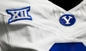
This week, the Big 12’s official X account dropped a nostalgic curveball, resurfacing the league’s late 90s and early 2000s logo in a simple “throw‑back” style post. The move was innocuous enough on the surface, just a nod to the conference’s heritage, but the reactions say a whole lot more.
Old‑school Big 12 and Big Eight fans saw it immediately as a homecoming moment. The “Block 12” emblem has always felt iconic to some of the conference’s foundational members, a visual anchor from a time when several key rivalries still defined the landscape. That group cheered the refresh: familiar branding, a subtle wink to the past, feels right.
On the flip side, the newer schools, those admitted in the last expansion wave, were less enthused. The sense among some fans: if you’re going to lean into nostalgia, lean into the inclusive future of the conference, not just the old guard. The throw‑back logo, they argue, feels like a wink to an era they weren’t part of, and a hint that the Big 12 values its legacy roots more than its evolving footprint.
Now, to be clear, this isn’t a crisis. The tweet didn’t spark outrage. But the mixed bag of reactions is telling: some fans got charged up, others quietly bristled. If you’re running a league brand, you pay attention to the temperature. And right now the temperature suggests a need for balance, honor the past, yes, but don’t overshadow the future.
The bigger question here is how the conference frames itself: a legacy league stuck in the past or a reinventing powerhouse ready for the next decade. This throw‑back drop gives us a peek at the mindset. Does it fit the whole membership? That remains a conversation.